
This post is mainly aimed to elaborate your knowledge about why we should have responsive web design rather than desktop and laptop based web from the business point of view.
Now let’s start discussing about the topic:-
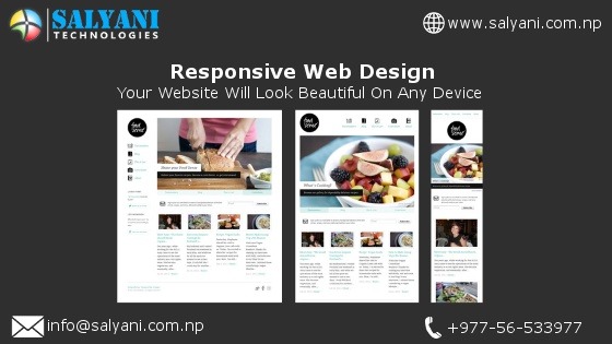
The website that best fits for every device that exists in this world is known as responsive websites. Responsive websites are designed with the aim to meet the end user requirement at different devices as well as easy to use and navigate. The sites that are bulky in mobile devices are rarely used or visited by the end user.
Websites that are responsive and can be opened in mobile devices easily are a great entry point for businesses to target their feet wet†in mobile marketing because, quite simply put, in today’s digital world it’s never been more important for local businesses to engage with growing mobile audiences.
Anyone thinking of getting into mobile marketing should remember that people consume information very differently when they are browsing the Internet on their mobile devices as opposed to their desktop computers.
Traditional websites are designed for access from a desktop or laptop computer, where the screen is large and the site is easy to navigate using a mouse and a full-size keyboard. For this reason, these websites typically offer a rich and interactive experience, and are designed to engage the visitor, build brand awareness and drive users to offline sales channels.
But when someone accesses a website designed for desktop computers from a mobile device, the last thing they want to see is the full-size website shrunk down to fit into their small screen, making it impossible to read or navigate without zooming and panning.
Mobile users want to land on a website that immediately presents the key information quickly, cleanly and concisely. They want a website that is easy to read and has the key information immediately accessible.
This means that a mobile website should be a much more simplified version of a main website, providing only the most important information — and it should be designed so the mobile site is easy for visitors to navigate using only their fingers.
Desktop websites are still very valuable assets, but do not translate well on mobile devices. Mobile visitors usually want to get in and out quickly, having found the specific information they were looking for. They are not interested in browsing or reading extensively on their tiny screen.
Source: https://salyani.com/